
INTERACTIVE RESPONSIVE SLOPE GRAPH [PROTOTYPE]
2025
Client(s): Self-driven collaborative internal work project
Project: Subject matter topic anatomy
Tools: D3, HTML5, CSS3, JavaScript, CoPilot
Categories: Interactive, Prototype, AI Builds
This prototype was built as a test run to upskill myself in the use of Artificial Intelligence tools to build better, faster, more robustly-coded innovative interactive content to visually illustrate a subject matter hierarchy from macro- to micro-level topic levels.
The genes of this experimental side project was such an interactive that had been created for an innovative AI/ML-driven publication analysis tool, crated using more traditional human-powered methods over the preceeding two to three years in a collaborative environment between researchers in Europe and development teams in India.
The initial interim solution was effectively built inside of two weeks, before being passed to a Lead Data Science colleague to develop further into a more complex data science-data visualisation project to support a multi-document analysis tool prototype being built by the data science colleague.
This project description page focuses solely on the visualisation, interaction and design decisions made in relation to the various multiple stages of development of the this interactive.
TL; DR: ‘vibe-coding’ is used to develop a usable interactive graph visualisation to assist users in exploring and better understanding results from their submission to a new MCP-driven multi-document topic anatomy summarisation tool.
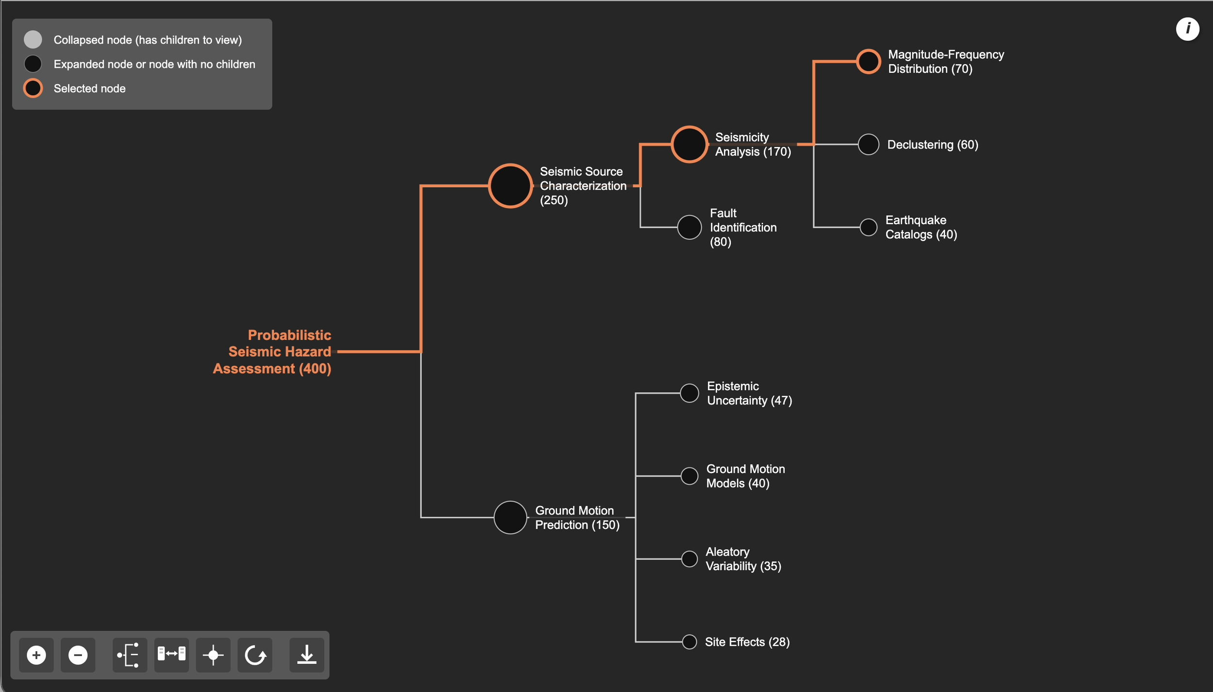
Initial primitive design build prototype of topic anatomy
Using a range of subtle but important functional and design features, we offer an enhanced and exciting visual experience for users to easily understand multiple subtopic metrics relating to their selected main topic and its related underlying sub-topics; for example, each sub-topic's absolute size and their relative growth compared with the main topic. This holistic experience is further enhanced through effective use of chart animation and transitioning, and ability to manually manipulate the view according to own personal user needs.
I gave myself a month to try ‘vibe-coding’ using Microsoft’s Copilot AI assistant in MS Visual Studio Code. I intentionally wanted to try building interactive, animated visualisations faster and with more robust code than my own habitual – and perhaps haphazard - old-school ‘trial and error’ approach I've come to adopt through many years doing data visualisation. I used a topic anatomy style visualisation as an example I was familiar with to try and replicate; the result can be seen below in the screen shot below and embedded video at the top of this page.
Firstly, we provide seven key functions that allow users to manually manipulate and move the chart to suit their own needs. These functions are, from top to bottom in the images above:
Show/hide legend
Download PNG image file of current chart view
Zoom in one step
Zoom out one step
Fully expand topic anatomy or contract topic anatomy to Level 1 only (depending on current viewed state of chart)
Centre chart’s current view state and display at full extent
Reset chart to original ‘onload’ view state
Each function is provided via simple-to-use one-step ‘shortcut’ buttons, avoiding the need to endlessly manually manipulate and reposition the chart using a mouse/trackpad (incidentally, functionality that is also provided on the interactive, but is often not realised as being available to users due to its inherent ‘invisibility’, and consequently not discussed in detail here).

Enhanced Legend
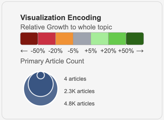
An informative yet compact information reference legend is also provided. This summarises the two mechanisms to encode information used on the topic anatomy. This legend can be displayed and hidden using the topmost button on the button panel.
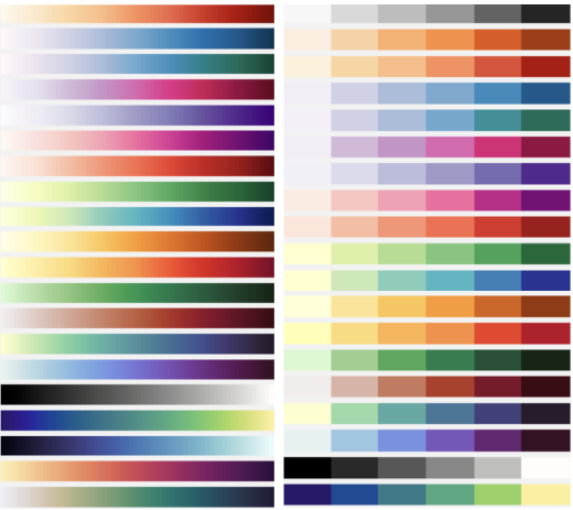
The upper colour ramp allows users to interpret coloured accents provided on subtopic labels; these assign distinct numeric ranges to each colour band denoting different grades of positive/negative topic growth compared with the main topic’s growth. Colour is most effective when used to encode nominal, ordinal or categorical data representing distinct groups rather than continuous values (below, left). When using colour for a continuous variable, it's often hard to accurately decipher the exact value, and it can be difficult to distinguish between [very] similar colours, especially when there are many categories. Hence, we try to avoid using continuous smoothly graduated colour ramps such as those illustrated below (right). Instead, we circumvent this design issue by using a banded categorical colour ramp; although it may still assign a single colour band to a small range of values (e.g. 0-5, 6-10, 11-15 etc...) it will always allow users to more precisely estimate the true value associated [to the subtopic].
The lower ‘scaled symbol’ image encodes subtopic size – measured using Primary Article Count – via scaled circle geometries. It is also dynamically generated; value labels presented adapt according to the numeric [minimum, maximum] range of primary articles of the main topic’s spread of subtopics for which the anatomy is built.
Separating how Relative Growth and Primary Article Count was encoded on the topic anatomy was a conscious design decision that is discussed in detail in the section ‘Coloured accent tabs introduced to show sub-topic growth rate’.
Ability to expand and collapse multiple branches at different levels
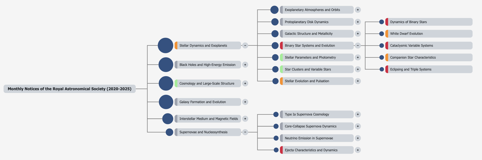
We felt users of this document review tool would really appreciate ability to evaluate subtopics found on different branches and at different levels of its topic anatomy. As such, we provided the ability for users to freely expand or contract any branch at any level at will, independently of each other. This provided a truly user-friendly, user-centric functional addition to the topic anatomy allowing them to assess and compare subtopics across the full topic anatomy hierarchy, and as such, make the view as simple or complex as the user needs to.
Automatic zoom-chart-to-full-extent
As users expand more branches on the topic anatomy, they risk extending the chart beyond the boundary of the underlying canvas. To counter this, we introduce the ability for any chart to ‘self-centre’, smoothly repositioning itself to always be fully viewable by automatically zooming the chart to full extent. This effect can be seen in the video embedded to the bottom of this page. This transitioning of the chart is set to occur when users either fully expand the topic anatomy – via the relevant function button – or expand a single branch.
Automatically sort and display subtopics by size attribute (number of documents)
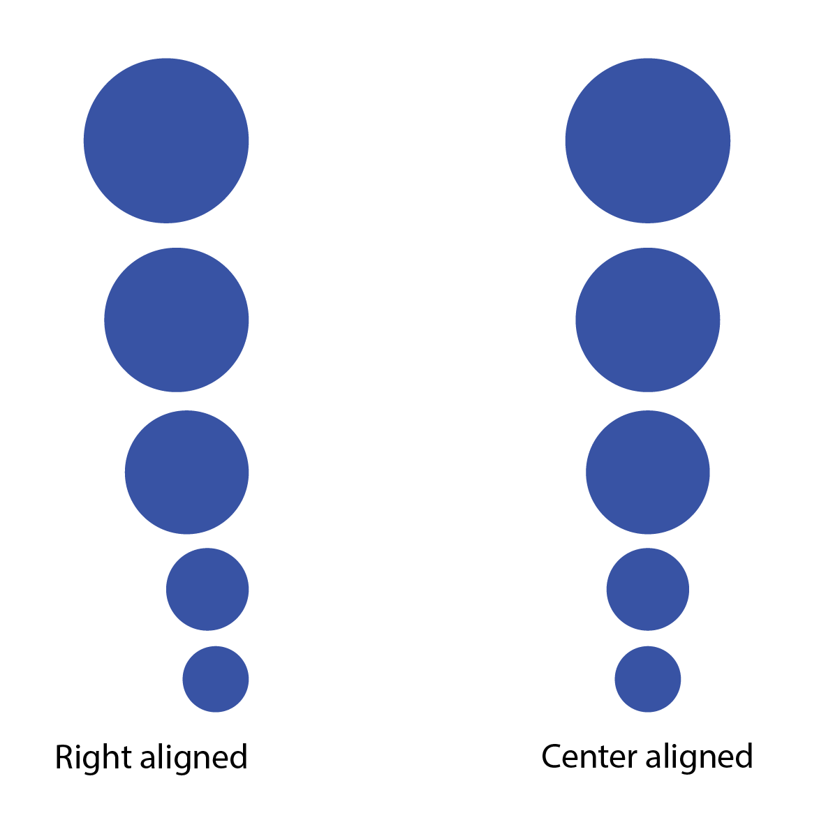
Each expanded branch displays subtopics it contains in descending order of absolute size (in this case, Primary Article Count). Each circle’s area is scaled according to this metric and we also ensure symbol scaling is achieved using the correct mathematical relationship (link; link).
Right aligning all scaled circles to allow users to more easily inspect and evaluate absolute differences in size of multiple subtopics as – even though area is the attribute scaled to the metric in question - a circle’s diameter, a linear scalar attribute, will also change as a function of this same metric. Thus, right (or left) aligning all geometries effectively mimics encoding these scalar values as a simple bar chart.
Right aligning these circles (below, left) also allows users to more easily assess variability between non-adjacent geometries, using the same basic pre-attentive attributes of length and area. Had these vertical tranches of circles been centre aligned (below, right), a user would – at worst - not have the additional benefit of circle diameter (i.e. a scalar attribute) to evaluate variation in size, or at best had to perform more time-consuming, attentive processing to accurately estimate differences in subtopic size.
Finally, right aligning all scaled circles also helps us achieve a ‘cleaner’ layout to the visualisation; By vertically aligning these scaled geometries, all label blocks, coloured topic growth accent tabs and expand/contract buttons are also automatically aligned, easing comparison and user interaction.
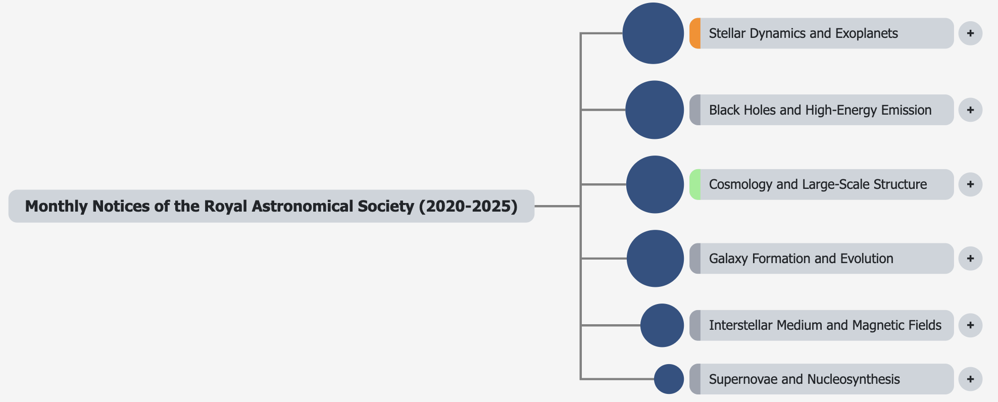
Coloured accent tabs to show relative sub-topic growth rate
Comparing growth of individual subtopics within a topic anatomy with respect to both the main topic itself and to each other is of vital importance to understand where major changes in research focus [may] currently lie. Consequently, this gives some indication as to which subtopics are potentially emerging - becoming more important - and which are decaying (becoming less important).
To assist with this, we introduce coloured accent tabs to quickly indicate relative growth of a subtopic compared with its main parent topic. This allows users to quickly identify which subtopics are growing and which are decaying, and through the legend positioned to the top left of the visual, determine an approximate size of the relative growth/decline.
Having each coloured accent occupy the same physical size and position – relative to the scaled circle and subtopic label to which they relate - minimises cognitive [over]load and lends itself to increased pre-attentive processing capability. The eye is not needlessly jumping back and forth across a column of coloured accents - instead it can quickly scan up and down the line of accents – and variable element size is not a distracting, false narrative for visually conveying information to the user.
We decouple use of colour to encode one attribute (Relative Growth) from using size for a second attribute (Primary Article Count) on each subtopic to avoid [physical] size having an artificial, misrepresentative influence on understanding the colour definition. This is often an unwanted effect experienced in the visualisation space; notably, for example on choropleth maps, where physically larger areas may often misleadingly attract more attention from the user than smaller geographic areas, even when they may not be the focus on the ‘story’ or trend being told. Consequently, hex maps are often a better solution to mapping geographical variability across a single metric, or cartograms if there is an underlying denominator against which to evaluate, for example, a resident population, people of working age, number of sufferers of a particular illness.
Colour should not be used to encode values on circles scaled by a second attribute because it creates a cognitive overload; humans are better at judging differences in size - and even better at judging differences in length - than in colour. When you use two quantitative encodings (colour and size), a user is forced to simultaneously process two different, potentially confusing data dimensions, which can lead to misinterpretation and makes it difficult to accurately compare values.
Size is a better primary encoding for quantitative values: Your eye is more naturally adept at comparing differences in size than in colour. For a visual element like a circle, size is the more effective channel for encoding a quantitative value, such as population or magnitude.
Colour is better for categories: Colour is most effective when used for nominal or categorical data, which represents distinct groups rather than continuous values. When you try to use colour for a continuous variable, it's often hard to accurately decipher the exact value, and it can be difficult to distinguish between similar colours, especially when there are many categories.
Cognitive overload: Presenting two quantitative values simultaneously (one through size, one through colour) forces the viewer to make two different comparisons at once, which can lead to confusion and errors.
Poor comparison: It's hard to compare values accurately. For instance, if you have two circles of different sizes, it's difficult to determine which one is larger without a clear legend, and it's even harder if they also have different colours representing a second variable.
Note: the colour ramp used here was selected just for illustrative purposes to emphasise how logically positioned coloured accent tabs could be used to encode key information. If this tool were ever productionised, more design work and user testing should be undertaken to select colour palettes more attuned to user accessibility needs and to accommodate users with colour-blindness and colour vision deficiencies (CVD).
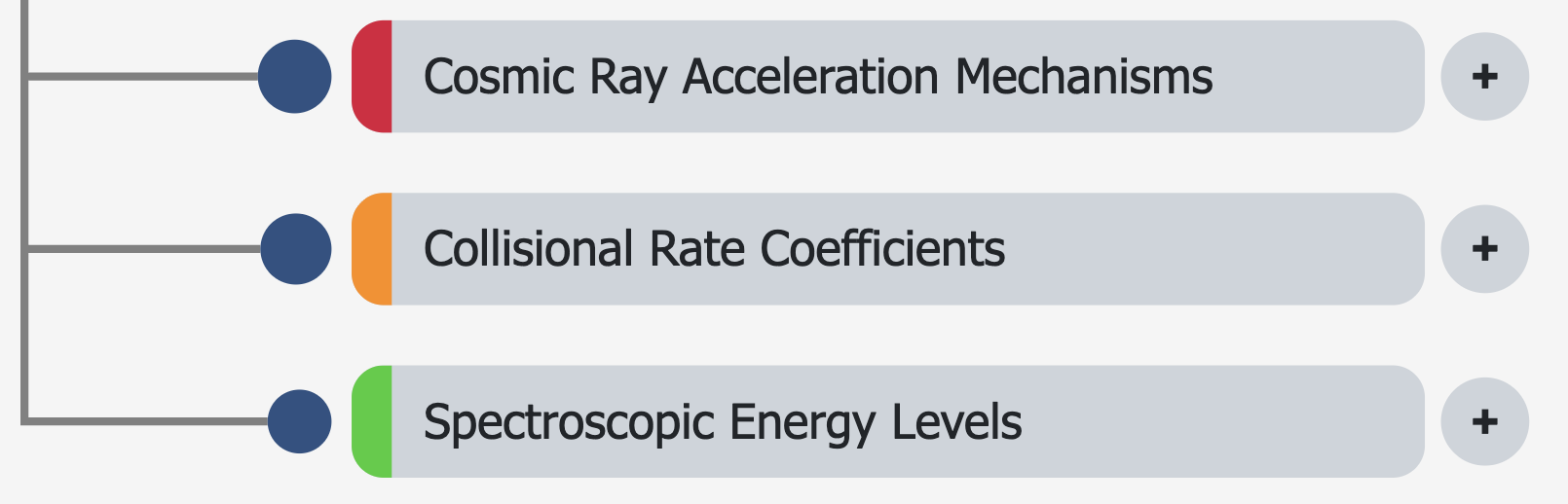
Fixed-width subtopic label blocks
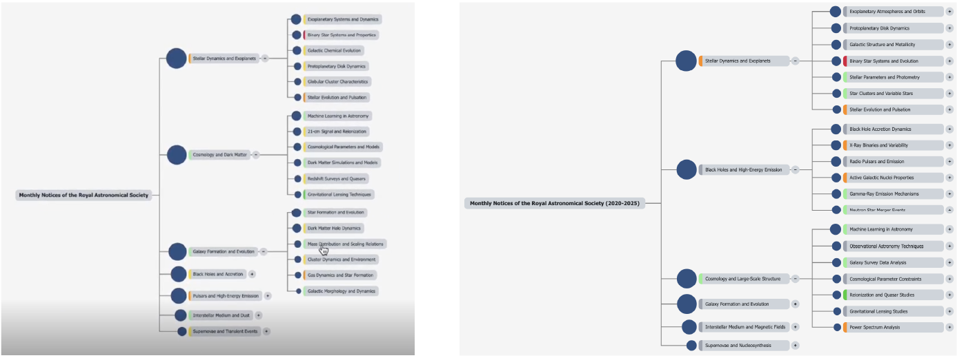
Earlier iterations of this topic anatomy used variable-width subtopic labels, based solely on the length of the enclosed label. As the topic anatomy’s development progressed, we increasingly felt this looked untidy, ugly and made user interactions – to expand and contract individual branches to the anatomy – more difficult (left hand image above). Adopting variable width label backgrounds also risked leading users to inadvertently and incorrectly conclude width was encoding another attribute, potentially leading to further confusion.
Harmonising widths of all label backgrounds gives a much cleaner appearance to the full topic anatomy, more notably appreciated when multiple branches are expanded. Doing so also automatically ensures all +/- symbols are vertically aligned, making moving the mouse cursor between them much easier and intuitive (right hand image above).
Downloading PNG image file of current view
Being able to manipulate the topic anatomy within the tool is all well and good but has limited use if you require to share a current state’s view with a wider audience, e.g. in a slide deck, or email attachment. You could easily manually create a screen grab, but these are habitually untidy, and not of consistently uniform dimensions. We resolve this but providing a ‘Download PNG’ button, that allows users to create a simple PNG file view of the current topic anatomy’s viewable state. This download mechanism is refined by only retaining elements in view that are of true relevance to the user.
Final Expanded multi-document analysis tool